These animations were produced from JULES4.9 (with 0.5 hour time steps) that dumped the data to disk every 6 hours of simulation calendar time (with the 2D variables saved as 1D with an ocean mask)
,
by using:
i) a CSH script (see below) that uses CDO to do the monthly averaging for the 11 year data set, which creates a new NETCDF file;
ii) a Python script (adapted from Emma Robinson's data visualization script), that uses the new monthly-averages 1D NETCDF file and saves the PNG animation frames to disk; and
iii) this ImageMagick command to merge the PNG frames into an animated GIF:
convert -set delay 0 -colors 256 -dispose 1 -loop 1 precip*.png precip_GL1979-1989.gif
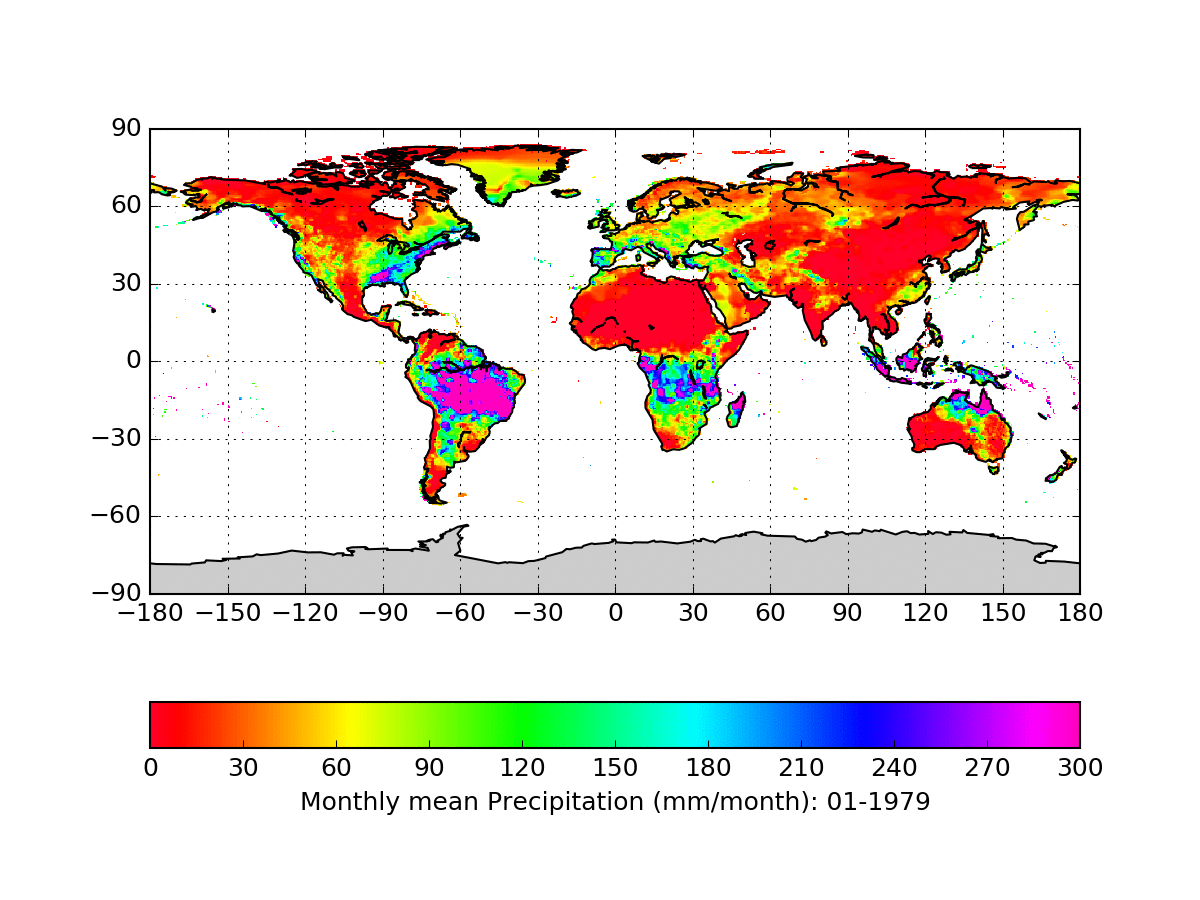
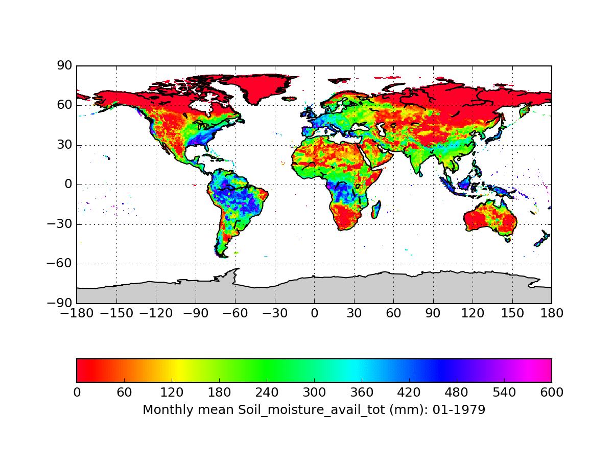
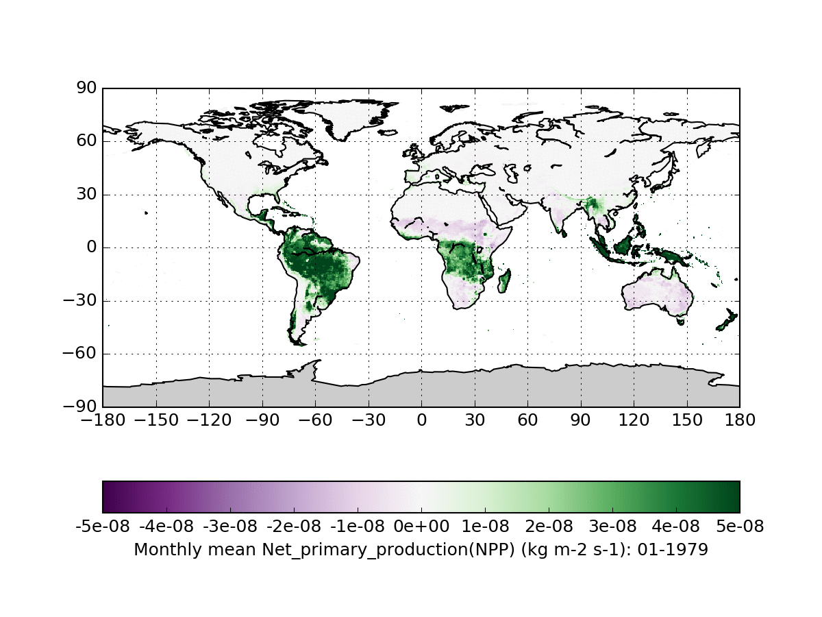
Compare these global animations to our previous Northern Hemisphere animations. The color bars have been changed since then, and we're now using Python to make the animation frames instead of Panoply.
Look at the P.McGuire@reading.ac.uk
Address:
Department of Meteorology, and
Department of Geography & Environmental Sciences
University of Reading